
ID Scan
Bread Financial: Across 5 Months
Challenge
How might we encourage customers to apply for a credit card during store checkout so that we increase credit card applications?
Measurement
We’ll know we’re successful when we learn if the proposed solution is desirable, feasible, and viable for users and the business.
My Contributions
Research plan, data synthesis, personas, user scenarios, user flows, wireframes, prototypes, usability testing, KPI definition, and UX project manager.
Learn
In May of 2018, a product owner asked the UX team to help design an in-store tablet experience that would make it easier for customers to apply for a store credit card.
To get the team aligned, we completed an assessment that outlined what problem we were trying to solve, what was already known, and what we wanted to learn.
The biggest questions we had were “are customers willing to use a store tablet to enter their personal information?” and “could they easily scan their driver’s license without assistance from a store associate?”. Without answering these, moving forward with the project would be very risky.
The team decided to test a working concept as soon as possible to answer our big questions. While our Innovation partners investigated technologies, I pulled insights from experts and existing research to create customer and associate personas that we could design for.


I also collaborated with the product owner and business experts to identify user scenarios. Combined with the personas, they would help us put ourselves in users' shoes when crafting content and applying design patterns.


Build
With testing approaching, the team shifted its focus to making sure scanning a driver’s license was a good experience. Working with an iOS native developer, we began outlining the information architecture and content structure.
Armed with the scenarios, I led the business experts and our product owner through a design workshop to account for the “happy path” user flows we wanted to test.
Now that we had alignment on the user flows, I fired up Sketch and quickly knocked out some wireframes. I imported the wireframes into InVision and shared them with our iOS developer to create a clickable prototype.

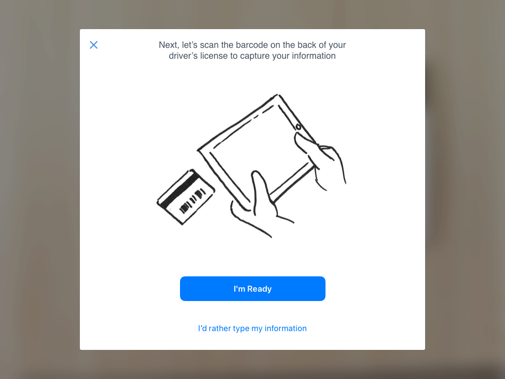


About a week later, our iOS developer had a working proof of concept (based on the clickable prototype and a native camera plugin he’d acquired). We were optimistic heading into user testing with our friends at Lextant, a human experience firm in Columbus.
Measure
Having a third-party test the design and perform research has its benefits. Specifically, they are unbiased and can often uncover insights that we as designers might not consider or overlook.
With Lextant, we recruited six cardholders and six store associates from our brand stores and got their honest reactions. After interviewing and observing the participants using our proof of concept, we were left with some answers and new questions.


The proof of concept scored a usability rating of “acceptable” from both customers and store associates. More concerning was the fact that half of the participants struggled with the concept’s primary function (scanning a driver’s license barcode using the tablet’s camera).
But the usability report from Lextant also gave us something else: direction. We could have very easily folded up our tents at that point, but we didn’t feel like we’d explored all options. We set out to revise the design and include better guidance on how to successfully scan the barcode.


With some tweaks to copy and design patterns within the primary user flow, we addressed a few usability issues and also provided a better how-to experience for users who were struggling with scanning. I updated our wireframes and created a new prototype for unmoderated remote testing.
Repeat
After revisiting our design and seeing improved time-on-task metrics during testing, stakeholders felt comfortable updating the working proof of concept in order to share it with a few store partners. Leaders from companies such as Victoria’s Secret and Express visited our offices to take the revised concept for a spin.

Store partners had just as much difficulty performing the task as their customers and store associates did. No amount of design could solve the physical challenge of holding a large tablet still long enough to scan the driver’s license.
It was at this point stakeholders decided not to pursue the store tablet solution. Rather than build an expensive native app that had to be supported on various tablets with updating operating systems, the project was shelved.
Pivot
Much of the team was understandably disappointed with the shelving of the store tablet concept. But our research actually helped us avoid building a solution that would’ve most likely failed, saving us hundreds of thousands of dollars and lots of man-hours.
Moving ahead, we theorized that the benefit of scanning a driver’s license to fill out an application was more in line with something a customer would do on their own - whether in the store or at home on their couch.
Instinctively, I began sketching out concepts for discussion.

This concept was simple: use the existing web acquisition experience and see if users want to scan their driver’s license as an alternate way to fill out the apply form. It was a quick way to measure engagement with a large, real world audience while minimizing development time and resources.
Of course, it would take some convincing but by using the power of Adobe Target, we could identify specific pilot brands to test with and cap how many brand customers even saw this alternate design - limiting the risk for stakeholders.


Impact
We hope to learn that this capability will lead to faster applications and fewer abandoned forms for potential cardholders. By comparing user metrics from the first and last design iterations, we’re able to measure design effectiveness.
The ability for customers to scan ID improved by 81%
Time-on-task for associates reduced by 32%
Error rates reduce by 37%